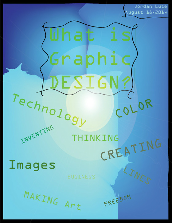
This is my first graphic design project. I gave ten responses to the question: "What is Graphic Design?" I used a variety of tools on Adobe illustrator, such as the shape tool, the warp tool, the mesh tool, and the calligraphy tool. I created a black border and a background. I also adjusted the colors to adopt a theme of blue and green colors. I tried to blend the elements together, however do to my inexperience some aspects look rather choppy and unconnected.
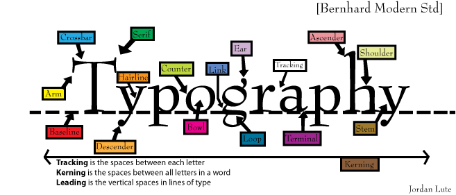
This is the second graphic design project I have created. I outlined all of the aspects of a Serif font. I used many tools, such as the pen to create arrows, and I also made borders around the words. I created a dotted line and solid lines with the line tools. I added different colors to the boxes to make it more visually pleasing.

This is a project that outlines the basic elements that are used in art. I learned how to effectively use the gradient tool, and I also found an effective fount for this project. This was fairly easy, and it refreshed my memory about what I learned and practiced in Art 1 and 2. I also learned how to save and place pictures into Adobe Illustrator. I am satisfied with the colors, and I like the examples I used.
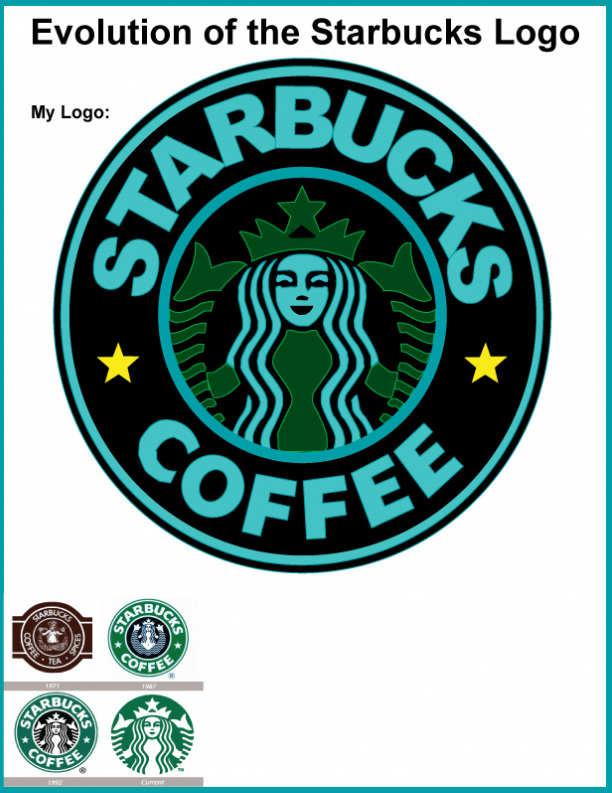
This is the fourth project that I have completed, and by far the most difficult assignment. I recreated the Starbucks logo by using the pen tool and other tools. It was extremely hard, and I am moderately satisfied with how it turned out. The only thing I wish I could have done better is the word "Starbucks," which still seems a little off to me. Anyways, I am glad I was able to complete this, as it tested all of my skills and allowed me to learn new things.
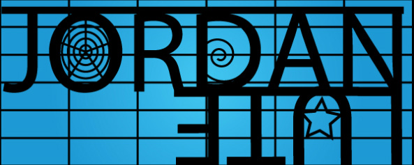
For this project, I created my own logo for my name. I used a multitude of tools, including the grid tools and shape tools. I used the rotate tool to flip my last name upside down. I think it looks clean and professional, and it only took me about ten minutes to complete. I am happy with the design, and I am satisfied that it was really easy to complete as well. A second Logo that I created is seen at the top of this page.
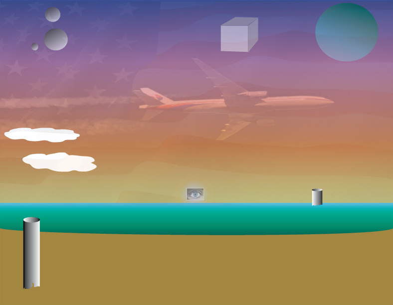
This is a painting/ drawing that I made in Adobe Illustrator. I used a wide variety of tools, but I finally learned how to adjust the gradient tool effectively. I like this project, even though it is really random. I enjoyed working on it, and I gained some new skills to use as well. I learned how to adjust transparency, and I used my knowledge from my two years of art to create three- dimensional cylinders, cubes, and spheres.
|
|
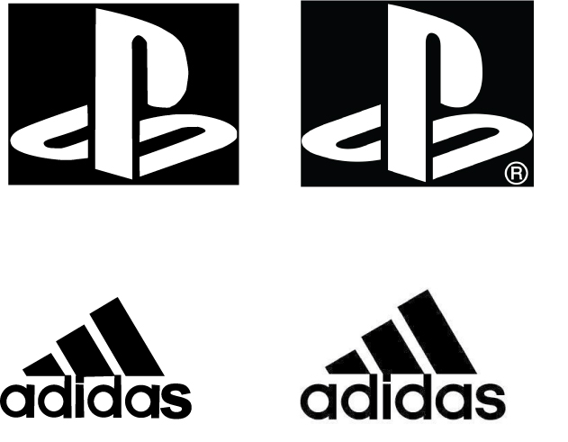
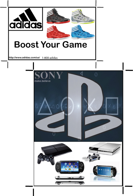
This was a project were I recreated two logos (top left) using the same methods as I used creating the Starbucks logo. These were quite a bit easier, however. After that, I used my recreations in a business card (bottom) and an advertisement (top right). this project was fairly simple, as I ave already gotten skilled with all of the tools required for this sort of project. I am happy with how everything came out, and I was able to complete all of it within a short amount of time.
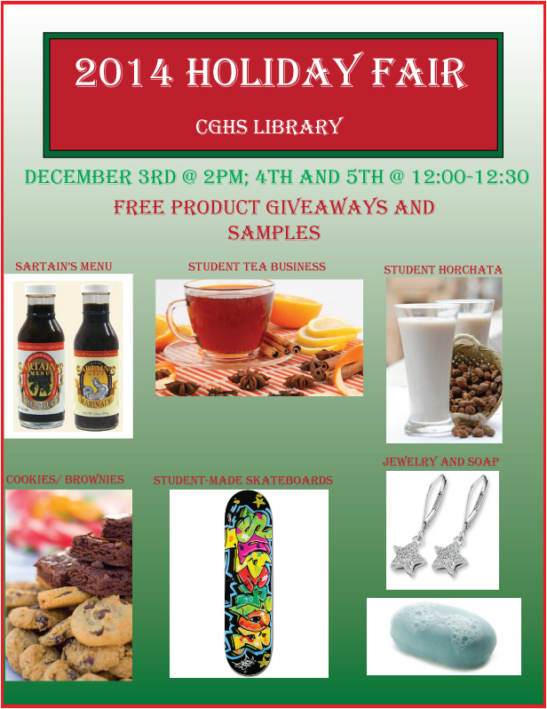
This was a project that I created for a holiday fair at my school. I used many of the tools that I have learned throughout the year, including the gradient tool. I used a new concept that we learned to create balance and composition. I am happy with how this turned out, and it was fairly easy, but slightly time consuming.
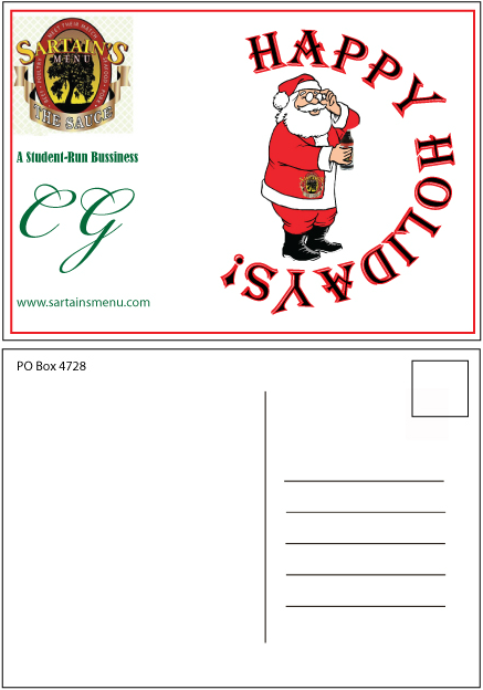
This is a postcard I made for Sartains. I used Photoshop to create Santa holding a bottle of the sauce. I had to research the specs of a postcard, and then I imitated them as best I could to make it appropriate for mailing. It was fun to play around with the text and wrap it around Santa. I used the contrast of Green and red to make it look interesting, while sticking with the original theme of Christmas and the Holidays.
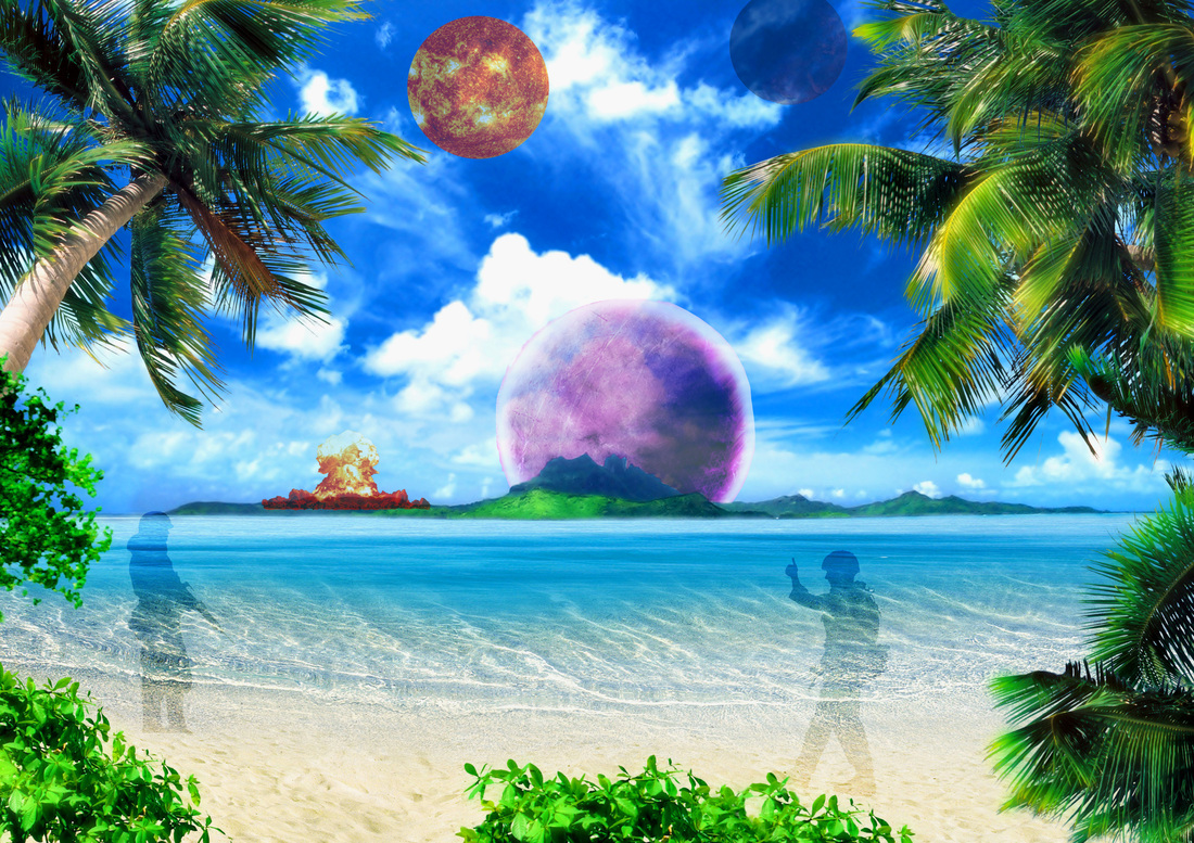
This is a project that I made on Photoshop using tools such as the three lasso tools, layers, and layer masks. It was challenging, but I like the way it turned out, and I am happy with how it looks. I used seven images, and altered the characteristics of all of them so that they blend together. I used the layer mask for the first time, which helped me add in the planets and blend them with the landscape.
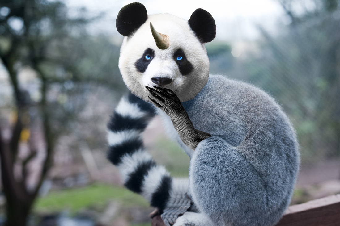
This is an animal that I created in Photoshop. I used the body of a lemur, the head of a panda, the arm of a komodo dragon, the eyes of a Siberian husky, and the horn of a rhinoceros. I think it looks good and I am happy with it. I used a lot of tools that were challenging to use but created a desirable effect. I tried to do new things like use the clone stamp, which I used to remove the Lemur's original arm to add the reptile's arm.
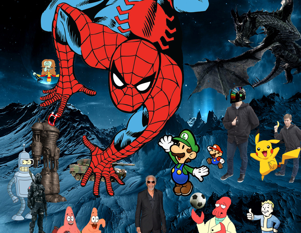
This is a collage that I created in Photoshop using 20+ images, 2 of myself. I used contrasting colors to make certain aspects like Spiderman pop out. Furthermore, I used Proximity to determine the placement of the images. For example, I had most of the images face the center, and I had some images layered over others. I used pictures from video games, real life, comic books, television, etc. I also added my favorite actor, Morgan Freeman, to the design. I am happy with the way my collage looks and It was fun creating it.
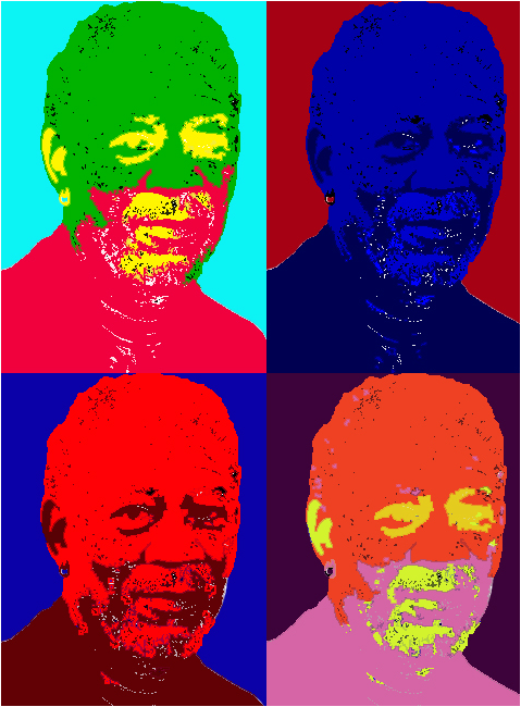
This is a Pop art Picture I made of Morgan Freeman. It was relatively easy, but I was frustrated because Photoshop crashed twice and I had to restart. Anyways, I learned how to edit the picture using new tools. I used the bucket tool for the first time, and i used it to colorize each duplicate of the original image. This only took me about half an hour, and I am happy with how it turned out.

|
|
|
|
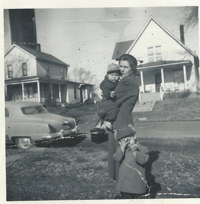
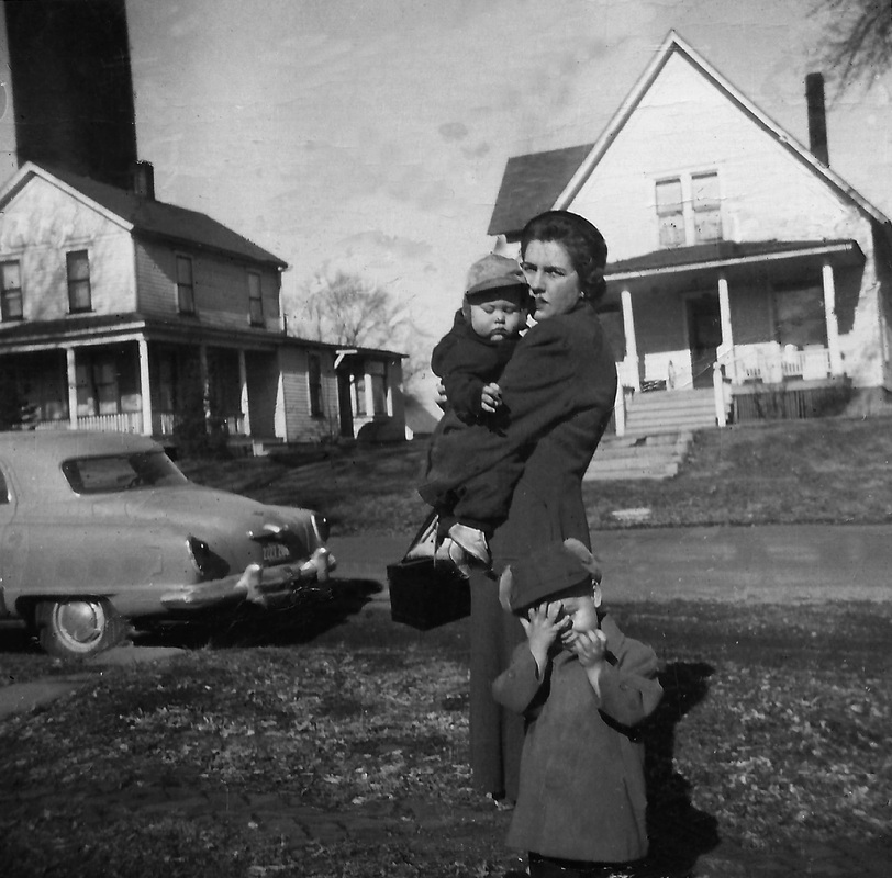
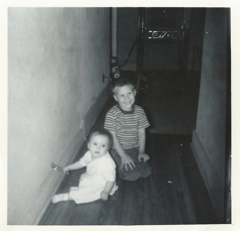
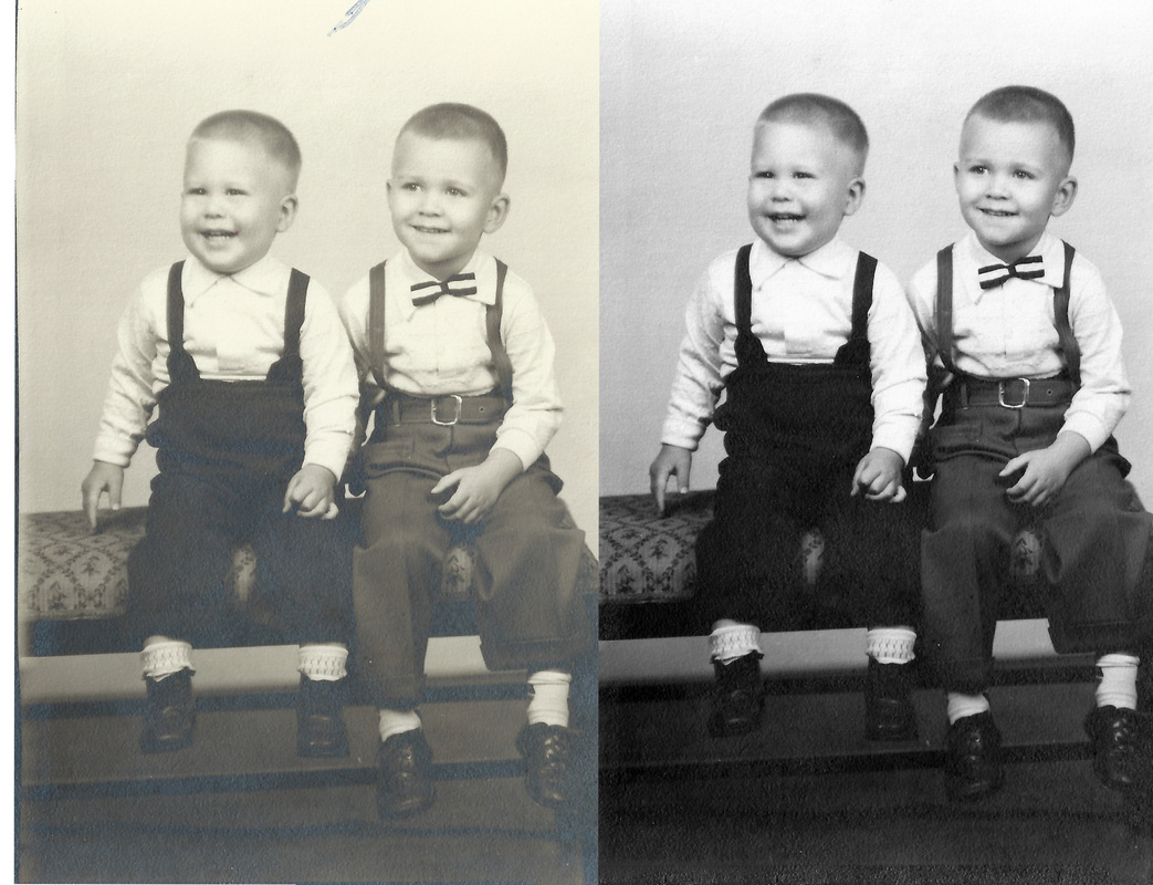
These are old photos that I restored. It was time consuming, but it wasn't very difficult. I think I did very well for my first time. I learned how to make numerous adjustments to photo. I also learned how to properly use clone stamp too. I used levels, contrast, brightness, as well as clone stamp adjustments.
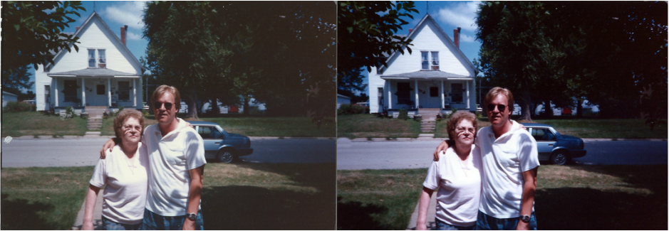
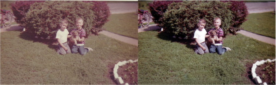
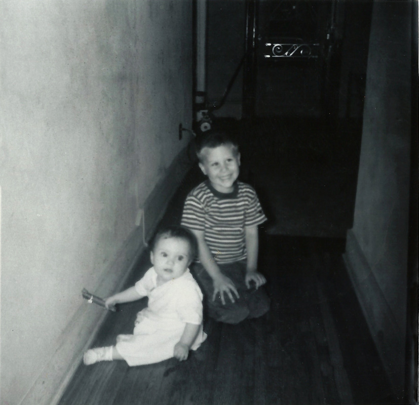
These are more old photos that a partner and I repaired and edited. I used all of the same tools, with the addition of the spot healing tool, which proved to work better than the clone stamp tool, in my opinion. The assignment was pretty easy, and I think the pictures look good.
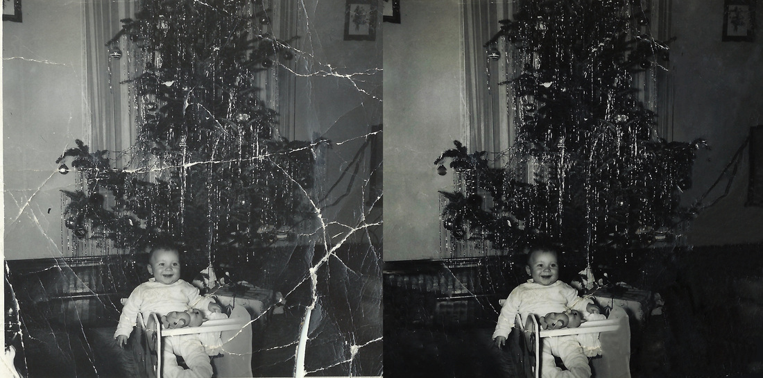
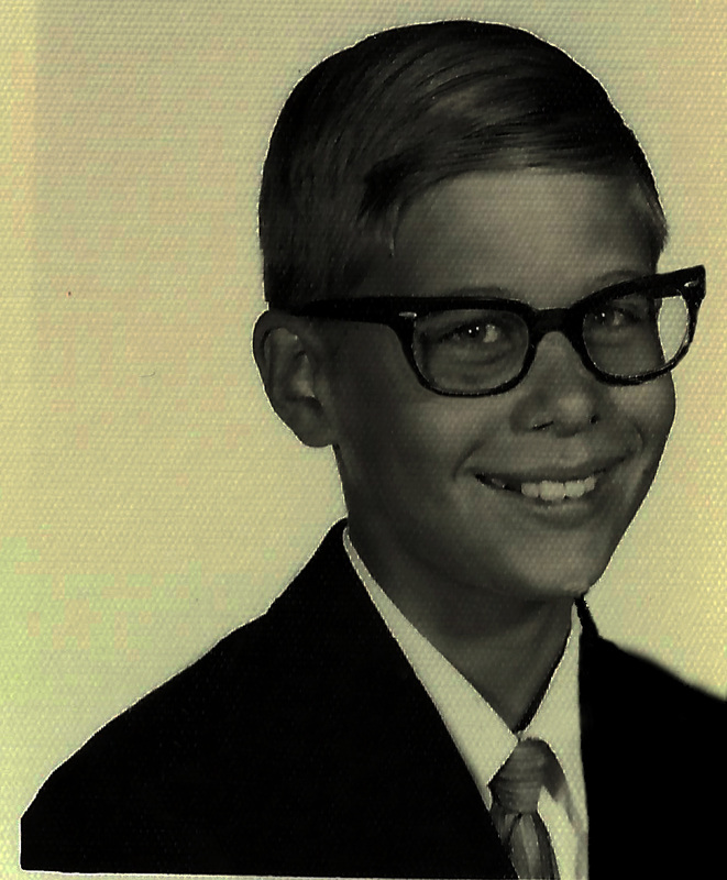
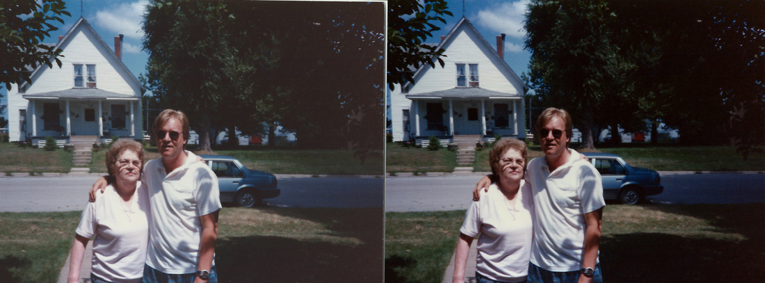
This is an extremely difficult photo that we were assigned to repair, and I didn't do as well as my other ones. It was extremely difficult to remove the tears. I don't think it is bad, but I wish that it looked a little better. I used the spot healing brush as well as the clone stamp tool, which each had strengths and weaknesses. I did try to do my best.
|
|
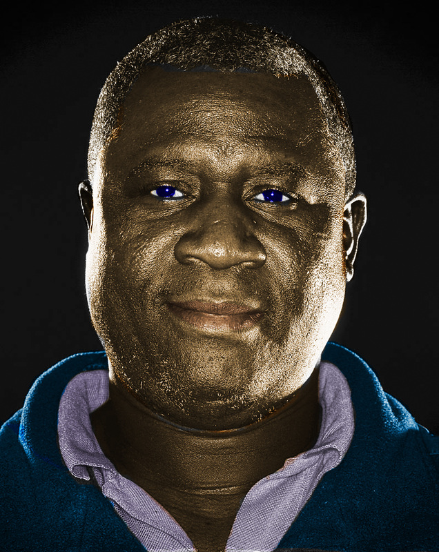
This is a photo that I colorized using solid color layers and overlay. It was fairly simple, and I think it looks good. I also used the quick selection and lasso tools to make precise selections. The hardest part was finding a realistic lip color, which I believe I successfully accomplished. It was easy to color the clothes, but it was difficult to color the hair and skin.
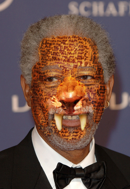
For this project, I blended Morgan Freeman with a jaguar. I app;died the fur pattern by using the clone stamp tool as well s the spot healing tool. I cut out the fangs by using the lasso tool. I think it looks surprisingly well. I used overlay and opacity tool to try and bled the pattern better.
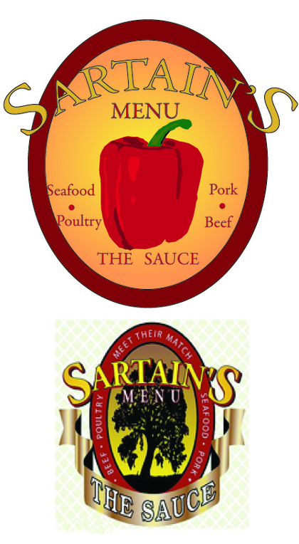
I recreated the logo for Sartain's menu. I used the pen tool to turn an image of a pepper into vector. I also used the shape tools to create circles. I used similar colors as on the original logo. I also used the gradient to make the background look nice.
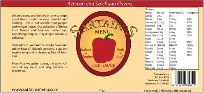
This is a label I created for Sartain's Menu.I used simple tools in Illustrators to create it. I used my remade logo for this label. I took the information from the Sartain's Menu website. The label includes product and Nutrition information, as well as important company information.
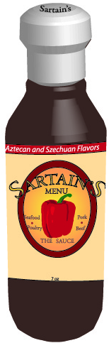
This is a three-dimensional bottle that I created for Sartain's Menu. I used the 3-D effect tool to alter one side of a bottle and recreate a 3-D version of the bottle. I used my own label on the bottle. I also made a three dimensional cap using the same tools.
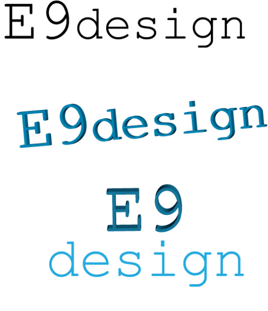
This is a quick project where I experimented with 3Dimensional letters. I used a 3D tool and played around with the ambient lighting to make the color look nice. I used a typewriter font because it worked well in 3 Dimensions. This was fairly easy and good to learn.
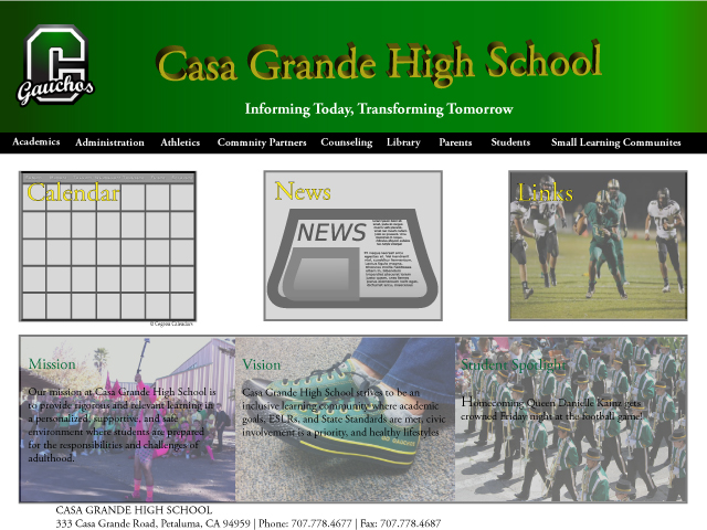
This is a recreation of the Casa Grande High School website. I used a lot of photographs from the website and other sources. I used guidlines and ruler to create good proximity. I used a gradient background an 3D letters for the header. I added all of the necessary elements. It was easy but time consuming to make.
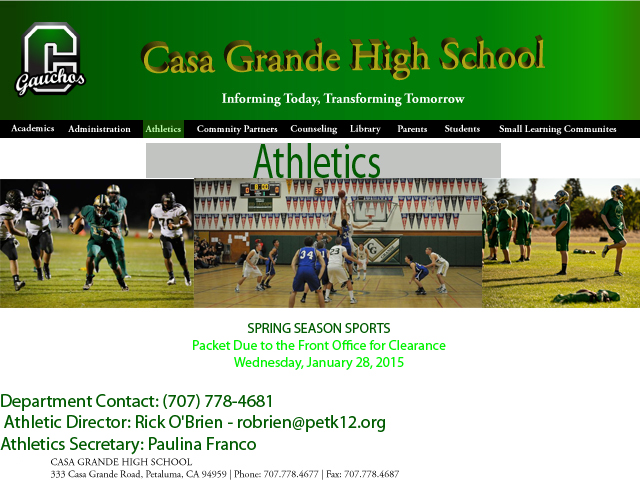
This is a page for the reinvented Casa Website that I designed. It has a few pictures and text, and a lot of the same content as the home page. I used text tools, and I formatted it so that it is organized and neat.
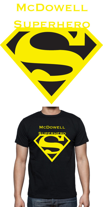
This is a T-shirt that I designed for McDowell School. I used the pen tool to redesign the color. I used scaling to reproduce it os the t-shirt, and that was all. it was really simple and fun to do.
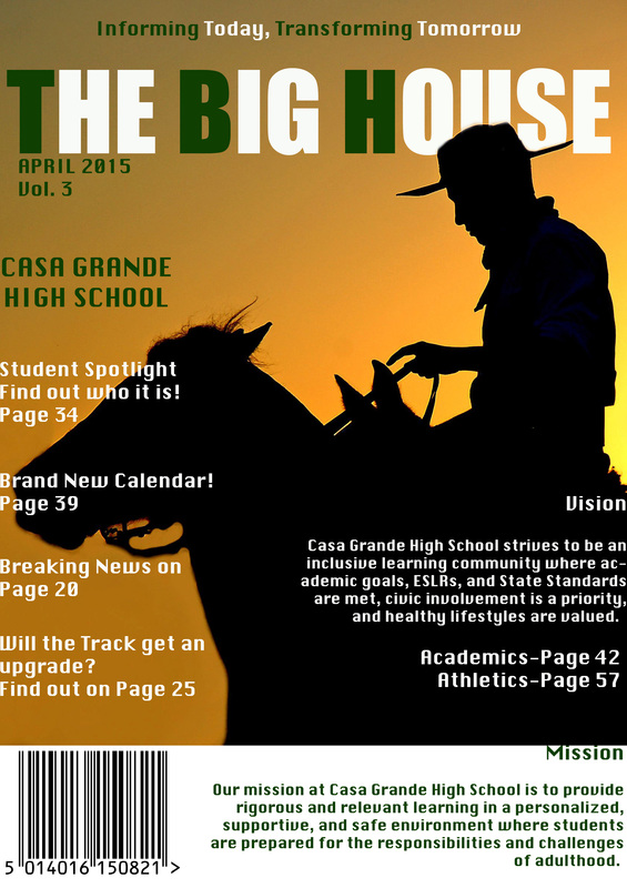
This is a magazine that I made for my school library. I used two different colors for the text, and a picture of a gaucho for the background. I used a layer mask to cover up part of the title and give the image a 3-D quality. I also added an image of a barcode and information from the school website.
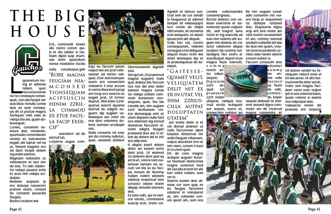
This is my first project that I made in Indesign. I used two different fonts and three pictures. I made two pictures bleed off of the page. I added the large letter in the beginning. The text is justified with the last line aligned left. It was an easy project and didn't take long.
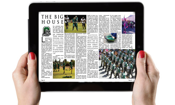
This is a quick project I made in Photoshop. I used a magazine inside spread hat I made and placed it on an I pad.
This is a project that I made in InDesign. It contains information on my future plans. I used simple tools like paragraph styles and text boxes. The collage was made in photoshop using tools such as the selection tools.
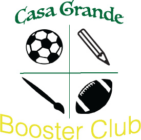
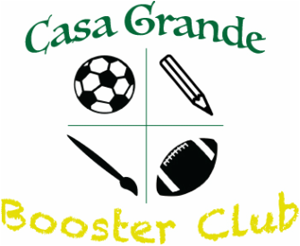
This is a logo that I made for the Casa Grande Booster Club. I used a few simple tools in Illustrator, and used vector art to symbolize sports, academics, and art. The updated one is the bottom version.
